FINAL EXAM ESSAY QUESTIONS:
Digital Art:
- 1) Describe the similarities and differences between a graphic artist and a graphic designer.
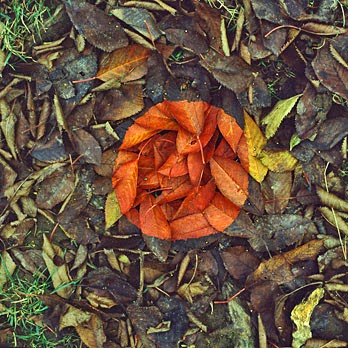
- 2) Using the Elements and Principles of Art, critique this artwork by “”.
- 3) Describe the function/purpose of the following Adobe Photoshop tools: *, *, and *.
Intro to 3D
Art:
- 1) Describe the similarities and differences between bas relief and sculpture in the round.
- 2) Using the Elements and Principles of Art, critique this sculpture by “”.
- 3) Describe the process (from concept to finished product) of one of the following projects: papier-mache animal sculpture, plaster cast baby dolls, or a wire linear line sculpture of a bird.
Ceramics:
- 1) Describe the similarities and differences between pinch, slab, and coil constructed projects.
- 2) Using the Elements and Principles of Art, critique this artwork by “”.
- 3) How do you prevent clay cracking while it’s drying and how do you prevent your project from blowing up in the kiln?
Painting:
- 1) Describe the similarities and difference between watercolor, tempera, and acrylic paint.
- 2) Using the Elements and Principles of Art, critique this painting by “”.
- 3) Out of the following painting styles, which one is your favorite style and which is your least favorite style. [Pop Art, Impressionistic, Expressionism, Abstract] Explain.
Sample Answer:
QUESTION: Using the Elements and Principles of Art, critique this artwork Two Cats by Franz Marc:
BAD ANSWER:
I like this artwork because it has cats in them. One is licking itself which is funny. The other is looking down like an idiot, so I don't like the yellow cat. I think they belong to the farmhouse in the background.
GOOD ANSWER:
The artwork Two Cats by Franz Marc has an interesting composition. The focal points seem to be conflicting because my eyes jump from the orange spot on the blue cat, to the bright red leaves, to the orange reflection in the pond, to the yellow cat. I think my eye is being led around because of the repetition of organic shapes, especially soft, circular ones. The artwork is not highly realistic, it is stylized with bright colors and a little value around the edges of the shapes. The artwork has a little depth because the artist used overlapping and adjusting the size of objects as it goes back in space, like the tiny little house in the upper left hand corner. The artist makes the cats pop out by using contrasting colors, the blue cat is on an orange background, and the yellow cat is on a blue background. Overall, I think the artwork is too chaotic for my liking because of too much variety in colors and shapes, despite liking the subject matter.


